Visual identity
3 companies. One path.
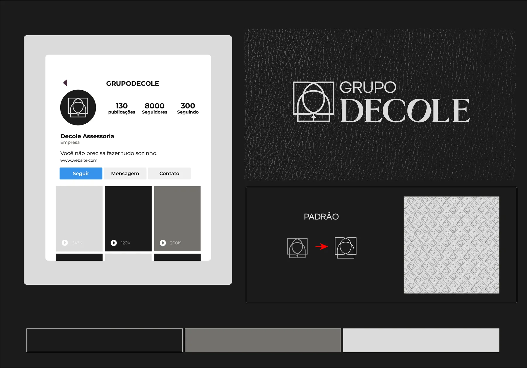
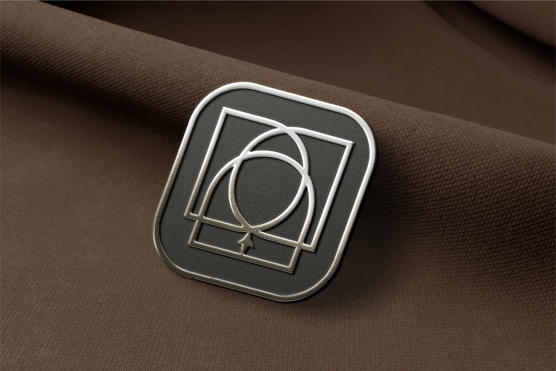
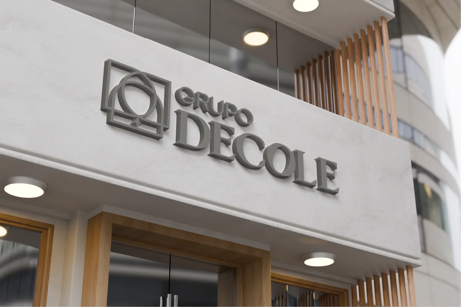
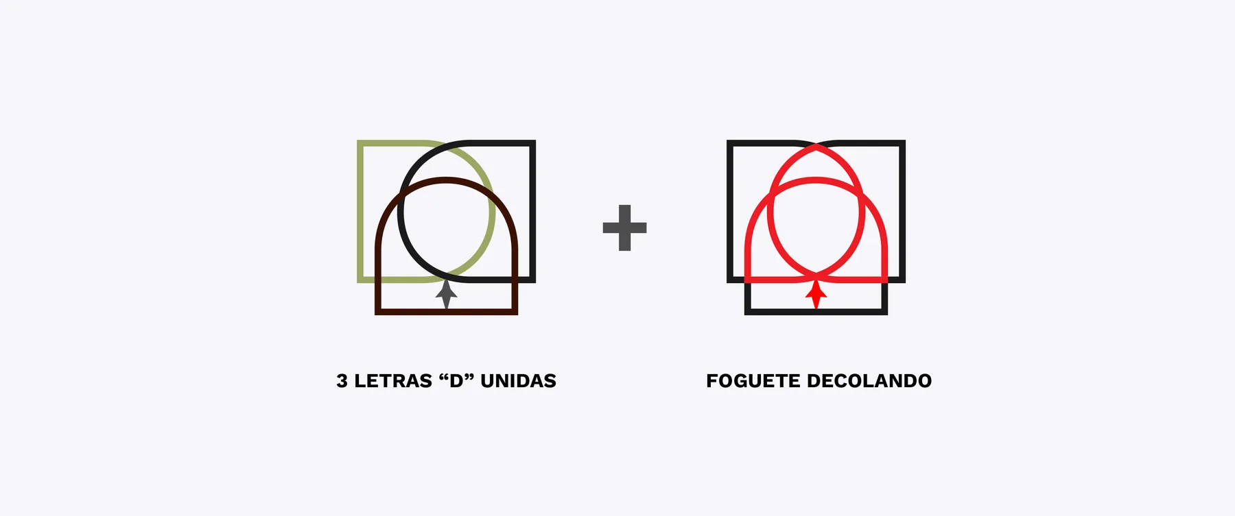
Grupo Decole came with a real challenge: unify the company's 3 business lines into a single visual identity that could adapt to each of them while keeping one narrative. We chose an aesthetic that balances tradition with dynamism. By merging 3 letter Ds (one for each company) into a symbol of propulsion, we built an identity that communicates security and acceleration to people who build solid legacies in the market.
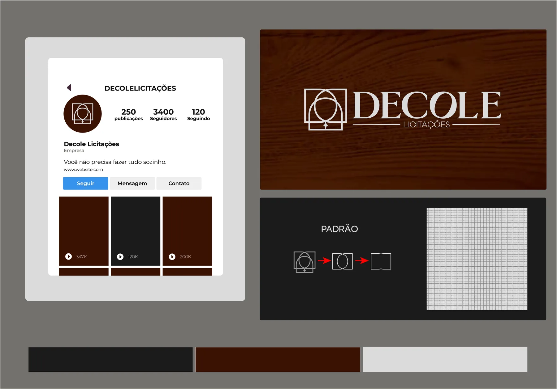
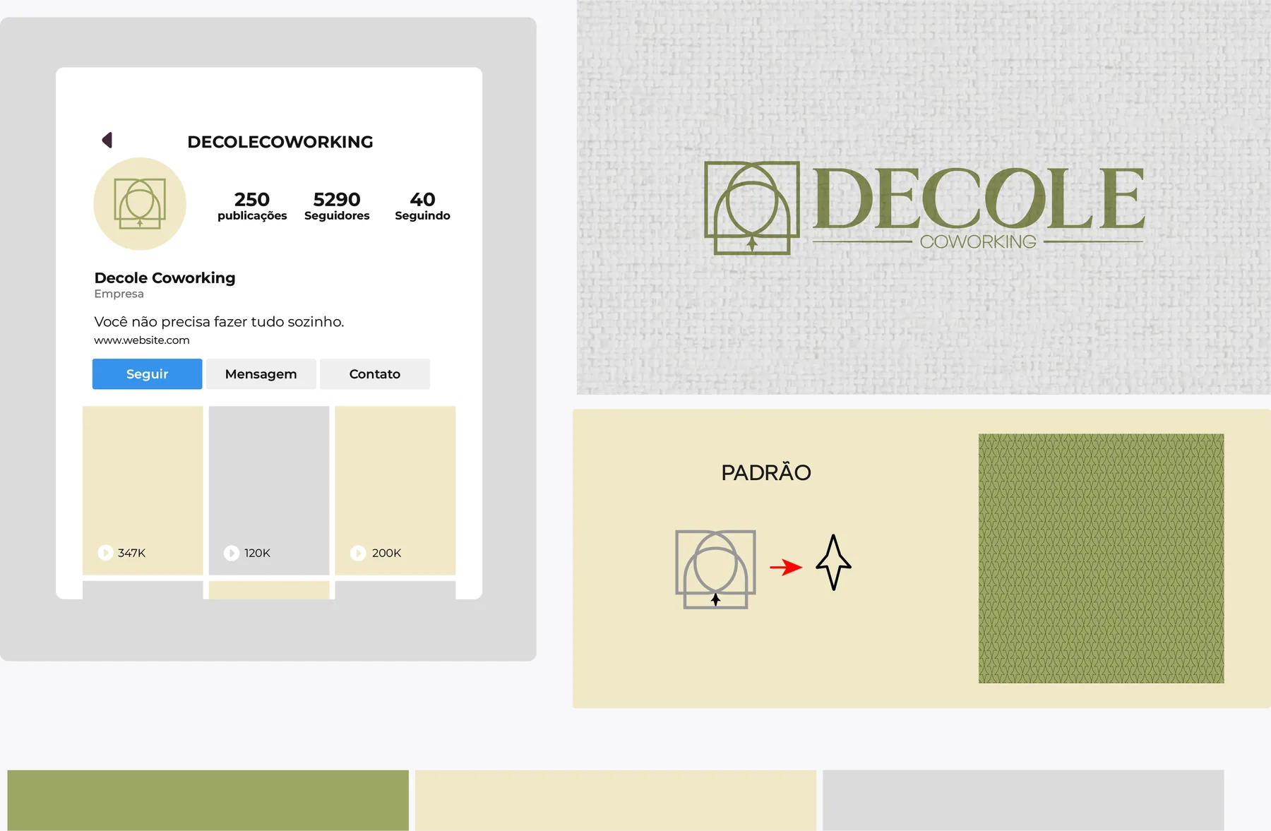
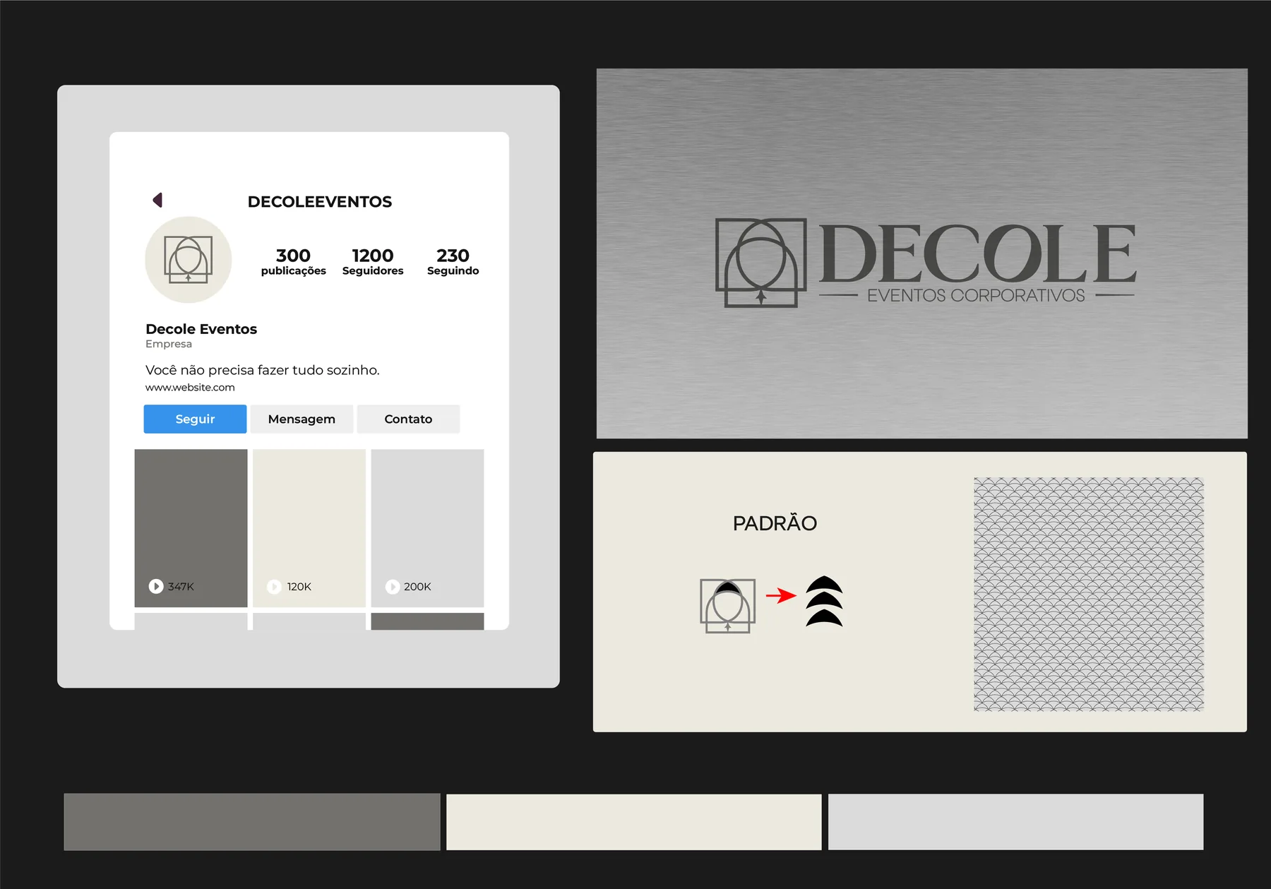
Although they work in different fields, all sub-brands share the same color base of Black, Graphite and Platinum. When colors repeat between the “mother” (the Group) and the “daughters” (the sub-brands), we create a Shared DNA. It tells the client's brain, subconsciously, that even though the services differ, the standard of rigor and excellence is the same.
- Client
- Grupo Decole
- Deliverables
- Logo and sub-brands, palette, textures and patterns, social profiles, applications
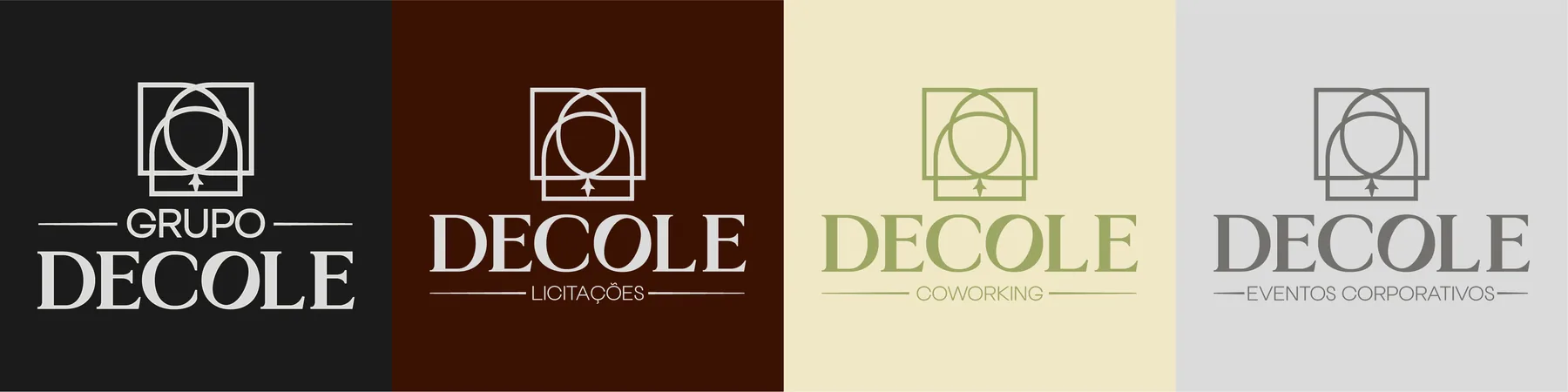
What sets each unit apart are textures and specific colors, the “sensory accents”, which guide the client's perception toward the specific benefit of each area: